What Makes This Special-Edition VW From the ’90s Look So Cool?
According to the fashion industry, it’s all about colorblocking and maximal minimalism.

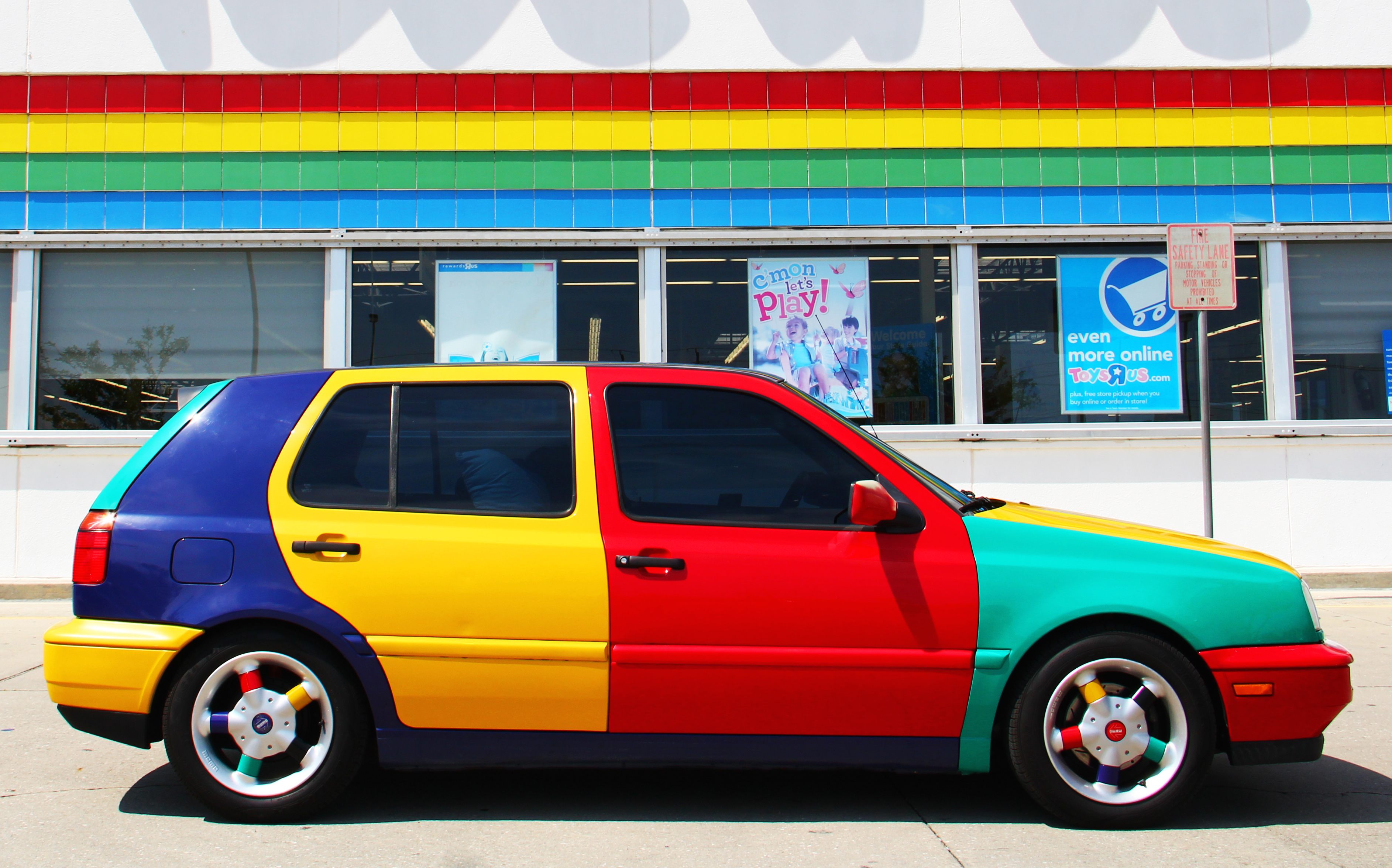
In 1996, Volkswagen began making the rounds for the North American auto shows with a new color of its four-door Golf hatchback. Well, not “a” new color, really: the car that would come to be known and prized as the VW Harlequin Golf is a four-color car: each door panel, the two bumpers, the hood, and the roof were painted in either purple, yellow, teal, or red. No one panel could be touching another of the same color. It looks like somebody disassembled four Fisher-Price toys and reassembled them while wearing a blindfold. It is probably the sickest car I’ve ever seen.
The Harlequin Golf made such a splash that VW eventually placed an ad asking the public if this should be a real car, that real people could buy. The response was an overwhelming “yes,” and VW eventually made, it seems, 264 of them, in a couple different configurations. Today the car pops up on message boards and Facebook groups about obscure cars, and sells for more than five times as much as an equivalent normal Golf from the same year.
I have become obsessed with this car. I have very seriously thought about flying to Florida to buy one. There’s something about those big, bold blocks of color that just grabs me. But what is it? Why does this insane, non-matching car feel so cool and fresh?
The Harlequin Golf’s styling is a textbook example of something fashion people call “colorblocking.” “Colorblocking to me is deliberately wearing a bunch of different complementary and contrasting colors together, without doing it in a print or a pattern,” says Connie Wang, a senior features writer at Refinery29 who has written quite often about colorblocking. “So picking individual items that are different colors and wearing them together, or one garment that has solid blocks of different colors on it.”

Colorblocking isn’t really something that can easily be traced to its starting point; it’s a basic enough concept that trying to find the originator of colorblocking would be kind of like trying to find the person who invented stripes. But it certainly had its heyday in particular eras of fashion and design.
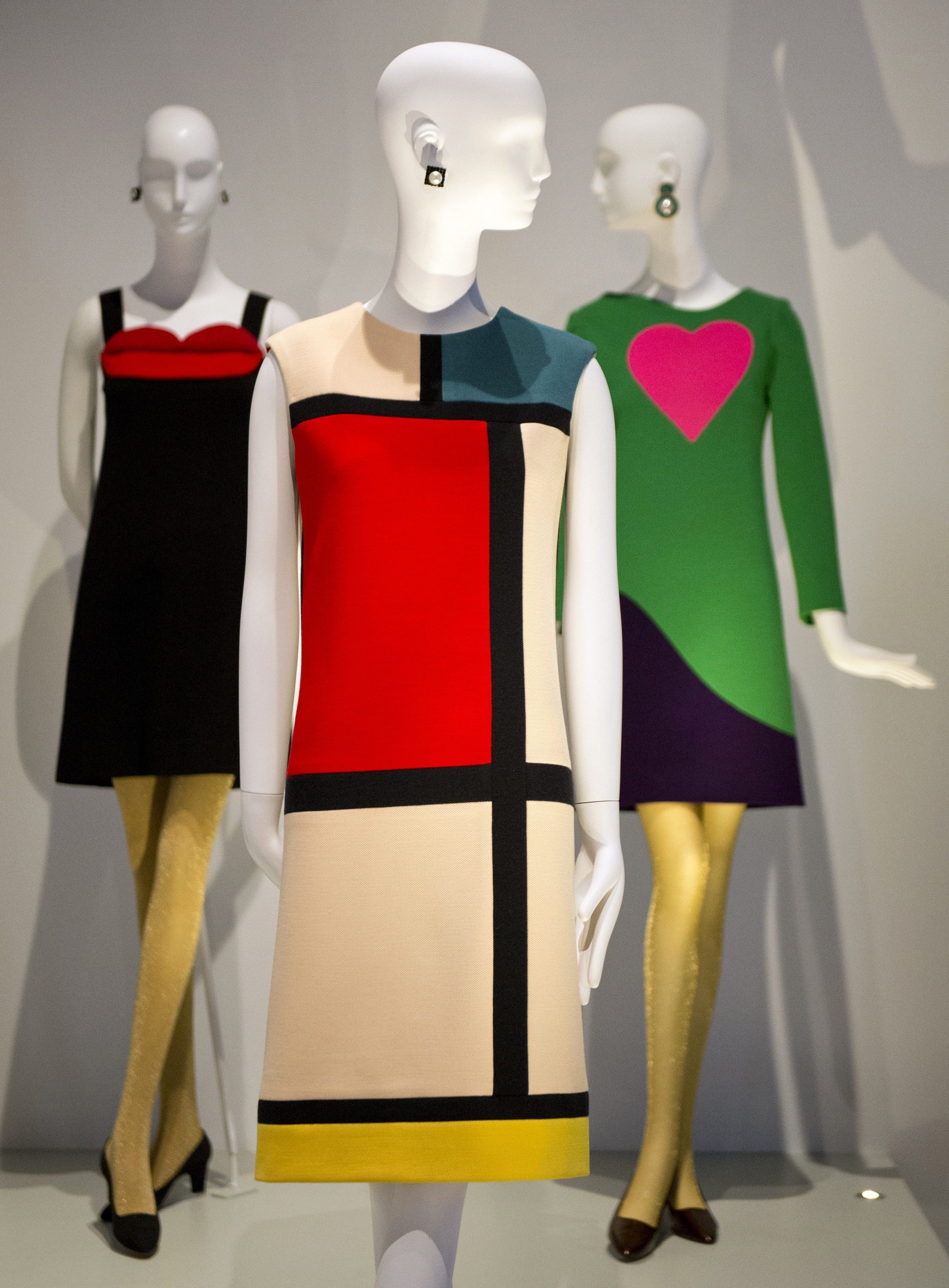
The first major example of the modern conception of colorblocking comes in designer Yves Saint Laurent’s 1965 collection inspired by the paintings of turn-of-the-century Dutch painter Piet Mondrian. Mondrian is best known for his paintings of irregular grids of thick black lines in which some of the intersections are filled in with primary colors. Saint Laurent’s dresses were pretty literal translations of these paintings into simple dresses: big black lines, blocks of bold color.

Though Mondrian’s work had been done decades before, the 1960s were a good time to revisit it. Pop Art, with its artificially intense colors, often used a technique called “hard-edge painting.” Hard-edge painting is pretty much what it sounds like: colors do not blend into neighboring colors, but instead form firm borders. Basically: red next to blue, in which red and blue remain completely separate and do not meld.
Colorblocking, like a lot of fashion ideas, went in and out with the decades. In the 1990s, it evolved to primarily focus not on one garment with different blocks of color, but many garments, each one with its own color. Big designers in the mid-1990s went crazy for this: Isaac Mizrahi and Versace both released bold, vibrant colorblocked shows right around the time that the VW Harlequin Golf was created.
It came back strong, says Wang, around 2011. “It was a big internet trend, there were a lot of YouTube videos and articles made about how to do colorblocking correctly,” she says. “I wrote about it constantly in like 2012. It was consistently a big SEO keyword for us.” (SEO refers to “search engine optimization,” basically trying to figure out what terms people are Googling and catering to those.) Today it’s more subtle. “Right now the big thing is monochrome, which is kind of the same idea, just a little more limited,” says Wang. Instead of wearing a pink shirt and teal pants, you might wear two different shades of white, or red, or tan. It’s in the same family as colorblocking, just maybe a bit more subtle.
Colorblocking is a theme fundamentally opposed to itself. It is a maximalist minimalism. In the 2010s, fashion tends to be heavily minimalist, defined by a paring down of excess. Not too many different pieces, few if any accessories, basics like jeans and t-shirts and button-downs. The problem with minimalism is that it can have the feeling of joylessness; many minimalist getups rely not just on basic designs but on basic colors. Blacks, whites, greys, neutrals. Blech.
What makes colorblocking so appealing is that it is a minimalist point of view. “Actually, the more minimal and basic each piece is, I think the better the overall outfit is,” says Wang. A simple t-shirt, a simple pair of jeans, a simple jacket and sneakers—that outfit can become intense and exuberant if each item is its own vibrant color.

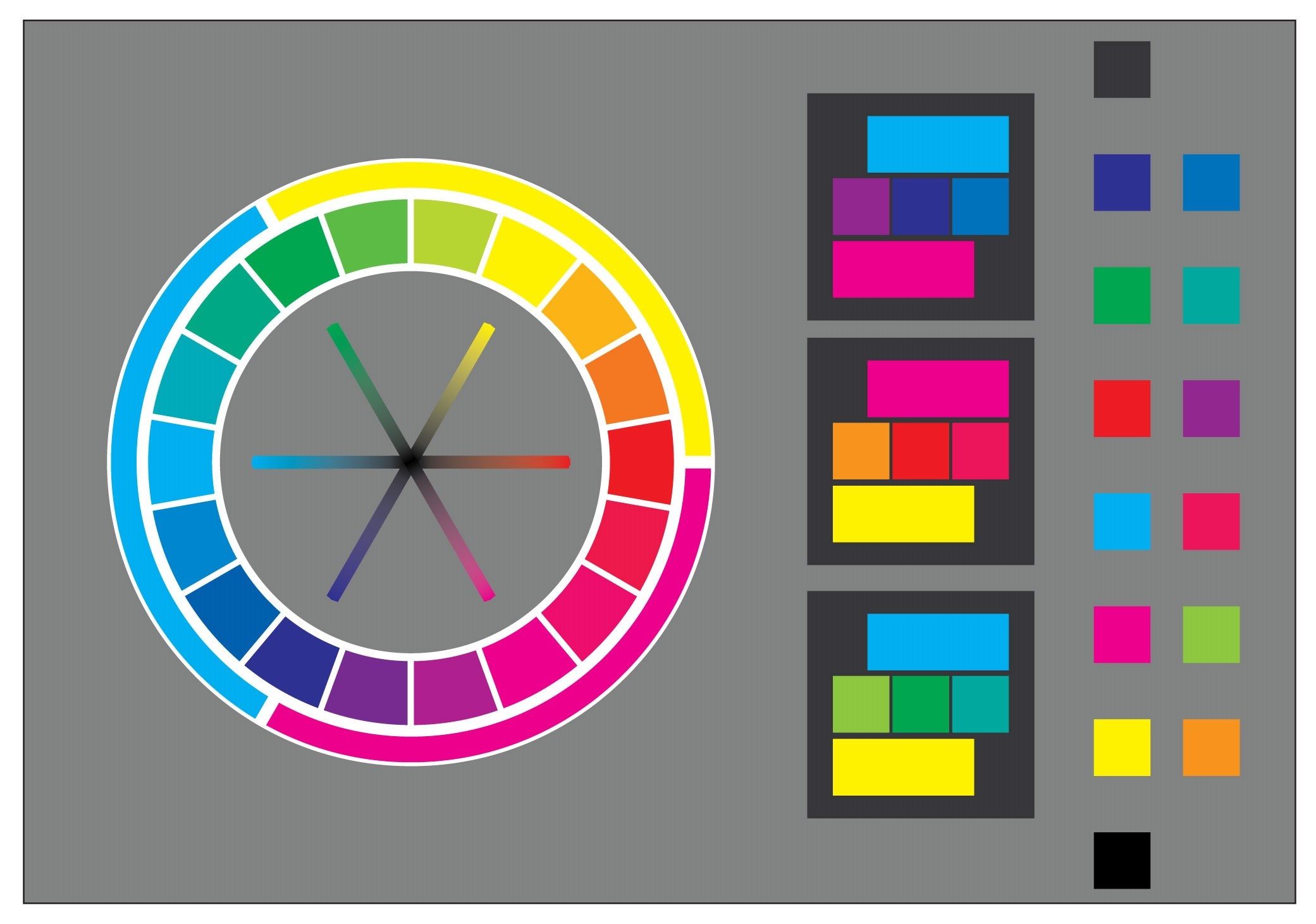
All those guides to colorblocking make it clear that, for this 2011-era of the style, you want as much conflict as possible. Take a look at a color wheel, an ancient creation borne of Isaac Newton’s understanding of the relationships between colors. The color wheel is set up so that colors on the opposite sides of the wheel would, if combined, create a neutral: black, brown, white, grey, somewhere in there. These are sometimes called “opposite colors” or “complementary colors.” You probably remember this from elementary school.
For maximum impact, basically every colorblocking tutorial instructs you to mix these complementary colors. Yellow and purple work well, in addition to those blue/orange and red/green constructions. But we don’t have to stick to scientifically opposite colors; our goal here is to shock the eye with huge contrasts. So neutrals and fluorescents work well: hot pink and brown, say, or neon green and khaki.

Another fundamental element of colorblocking is its accessibility. Wang described the kind of person who likes, or liked, to colorblock as someone more interested in the creative aspect of fashion than the status aspect: a person who would shop at thrift stores rather than designer boutiques. This is a style that can be done by anyone, because the value of each individual piece is much less important than the impact the outfit has as a whole.
That VW Harlequin Golf, weirdly, is a perfect example of this. My first assumption when I saw that car was that Volkswagen had simply painted the car with different colors. But that turns out to not be the case at all. What VW did was make a purple Golf, a yellow Golf, a teal Golf, and a red Golf, and then took it completely apart, scattered the parts around, and reassembled it from parts of all four cars. The Harlequin Golfs tend to be referred to by their “base color,” meaning the color of their roof and a bit of their sides. The doors, hood, and bumpers, though—those all came from completely different cars.
And that’s the key to why colorblocking works, and why we like it. A colorblocked piece—whether that’s a painting, a car, or an outfit—is simple in all its component parts, and yet blasts you with complexity as a whole. It’s a technique that allows for a maximum of experimentation, and yet requires basically nothing in the way of initial investment. It’s a mark of originality without being weird: after all, that Golf is just a Golf.
Plus, bright colors are fun.


Follow us on Twitter to get the latest on the world's hidden wonders.
Like us on Facebook to get the latest on the world's hidden wonders.
Follow us on Twitter Like us on Facebook